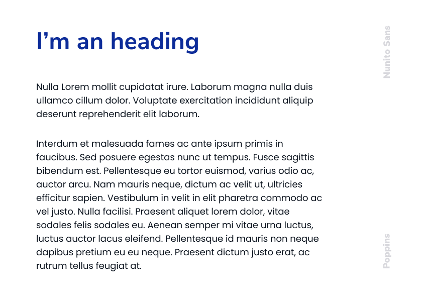
We have decided to move with two different fonts, both of them convey a different message.
Alignment
Font must be aligned to the left, do not centre align, unless a simple header (few words) is used on banners or buttons, on such situations if the body text is aligned to left, the header must follow the same principle.
Nunito Sans
Is the font to be used on headers, it offers us a more serious and delicate approach.
Sizes
General usage
At this point and apart from web usage, we are not implementing any rules for font size usage.
Web usage
We have based ourselves on bootstrap 5 sizing. Assuming that the default value for 1 rem is 16 pixels.
h1 - 2.50rem = 40px
h2 - 2.00rem = 32px
h3 - 1.75rem = 28px
h4 - 1.50rem = 24px
h5 - 1.25rem = 20px
h6 - 1.00rem = 16px
Header Colour
Promote the use of primary colour as much as possible, for sub-headers go with
our light blue. On darker backgrounds, white is the colour to go with, for sub-headers you can pick our secondary colour.
Poppins
Poppins is the font to be used on long text fields, it will concede us a more friendly yet readable approach.
Sizes
General usage
At this point and apart from web usage, we are not implementing any rules for font size usage.
Web usage
For web usage, following bootstrap 5 guidelines, the font size must be 1rem which by default is equal to 16px.